Side Projects
Not all of the coding I do is for research. For old classes or just for fun I have a few other projects that I've done. They're all on my GitHub page but here's a synopsis of the ones I'm proud of
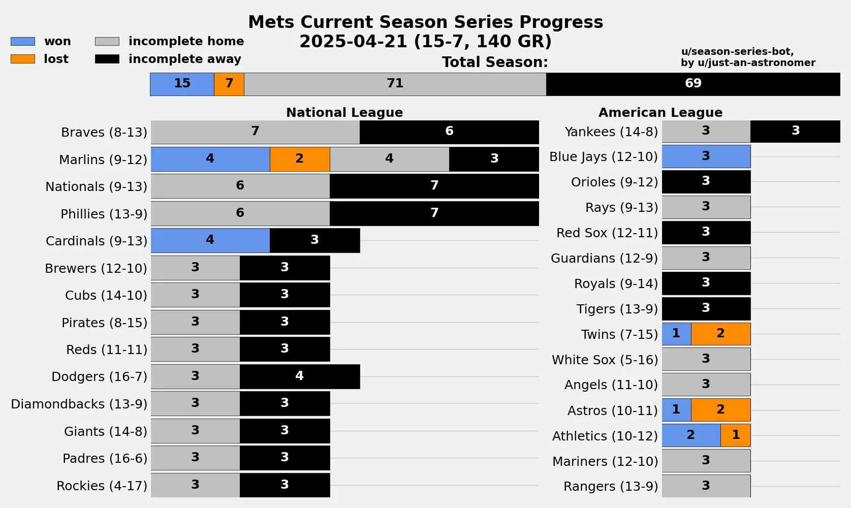
Season Series Bot
https://github.com/ctmurphey/season-series-bot
I've very passionate about baseballI found it a very interesting perspective to see not only how my MLB team is doing overall, but how they're faring against individual teams in the league. I wrote a script that pull game data straight from MLB's Stats API, sorts the games by my team's opponent, and visualizes it as a stacked bar graph that gradually fills up over the course of the 162-game season. I then wanted to share it, so I made a script that, with the click of a button in VS Code, I can both generate the plot and upload it to r/NewYorkMets with the bot u/season-series-bot. It's sparked quite a bit of discussion in the comments about individual games/series against certain teams that had large effects on the current state of the team. I just think it's a super neat visualisation.
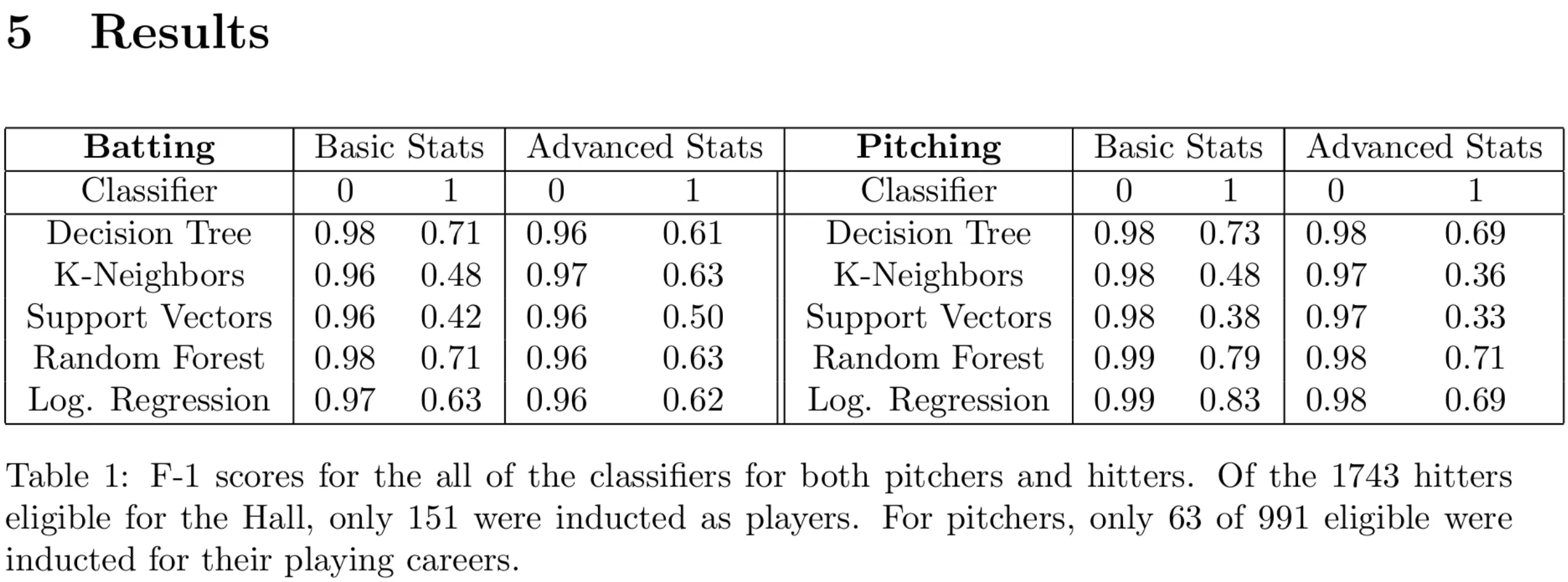
Machine Learning Methods to Predict Baseball Hall-of-Famers
https://github.com/ctmurphey/ML-BaseballHoF/
This was for a final project for AMS 561: Introduction to Computational and Data
Science for the Fall 2022 Semester at Stony Brook. The goal was to test how various ML methods were able to
classify whether or not a player made it into the Hall of Fame. Data was initially in the forms of
individual player season tallies, from which various stats were tabulated. For more details, please
read the pdf in the GitHub repo and peruse baseballstats.py to see how the stats are
calculated.
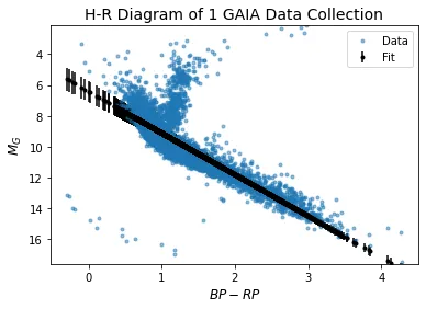
Using Markov Chain Monte Carlo to Fit a Law to the Hertzsprung-Russell Diagram
https://github.com/ctmurphey/H-R-Analysis
For my final project for PHY 521: Stars at Stony Brook, I played around with some Gaia data and fit a power law to the main sequence portion of a Hertzsprung-Russell (H-R) diagram using Markov Chain Monte Carlo (MCMC). The first portion made the naive assumption that all of the points were equally valid for the fitting, which isn't the case. In the diagram, there are also red giants, white dwarfs, and other contaminants that make this version a poor fit. By fitting a second distribution, one that can account for the outliers, we can improve the fit much better and get a reasonable line.
For those who aren't familiar with them, I'd recommend looking up H-R diagrams. They're just a plot of stars' color or temperature (they're related) vs their intrinsic brightness. This simple plot, first made in the 1910s, massively increased our understanding of how stars evolve over time and are probably my favorite astronomy technique for how much such a simple scatter plot was able to teach us.